Keep drawing.
See you in August.
Saturday, July 21, 2007
Tuesday, July 17, 2007
composition stuff
here's some weird landscape ideas I had. I was wondering what you guys thought. I've been messing around with the social layers of the mountain thing, trying to make an interesting composition, and just started playing around with guash and this weird Chinese "Guash" paper that's sort of a long story (and unfortunately isn't good for guash at all and has this weird circle texture.) That and I'm sorry about my camera. I take pictures in the middle of the day without my flash so that its not overexposed, but unfortunately it came out underexposed today. I'll come across a scanner eventually for all this stuff. That and I paint better than this...on almost every other type of paper. If I work the Xue Shuan too much it starts dissolving on me, haha. It was a struuuuuggle
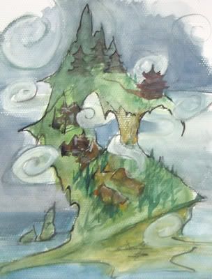
There's this island idea where they could build off of eachother in some fantastical way. Only prob is that it looks like a pirate island. yar. This might be drawn out, but it was designed to look something like the dragon river spirit. The fog needs help, too. I drew it on sort of half hazardly because it was a thumbnail, and I have a tendency to do weird skies on thumbnails. I don't know why.
Then I thought about pirates of the Carribean, and about how the most recent one starts off in Thailand or something, and the whole city was actually built on the water on stilts instead of on land. I thought "hey, what if the poorest levels was on water in a bay, with the richer areas literally rising above and around them?" So I've got this thumbnail to sort of visualize whats goin down. Hopefully it makes sense.
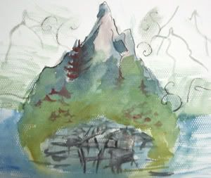
That or it could just be a simple mountain, but there's this part of me that just can't do that. I tried to do that...but then made it floating. Like this.
Then I remembered they already did something like that on Star Wars. (also, the colors on this are...so different than they are right now. I leveled it but there's only so much you can do, that and apparently whats normal on my monitor is sort of yellow on all elses.)
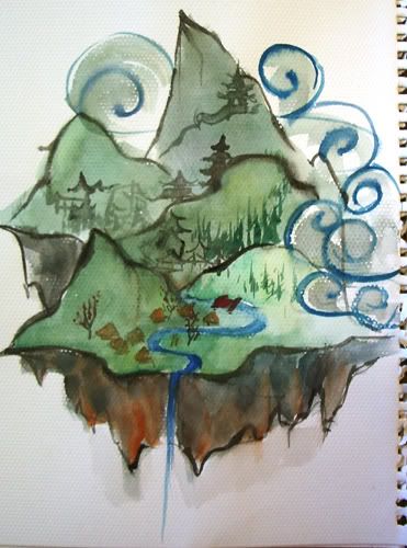
Another weird idea--I remember this book on pictures of China I had at home, and this one village was on a mountain so steep that it looked like it was built into the mountain, a lot like the Native Americans did down in Four Corners (but on the base instead of the top of the cliff.) I was thinking that it appeared so cramped and busy with the houses piled on eachother like that, it would be good for a marketplace or poorer situation where things are stressfull and ... busy. Just a random idea. Plus, there are those huge statues carved into Mountains down in China, and you could stick a couple in the backgrounds to look pretty.
There's this island idea where they could build off of eachother in some fantastical way. Only prob is that it looks like a pirate island. yar. This might be drawn out, but it was designed to look something like the dragon river spirit. The fog needs help, too. I drew it on sort of half hazardly because it was a thumbnail, and I have a tendency to do weird skies on thumbnails. I don't know why.
Then I thought about pirates of the Carribean, and about how the most recent one starts off in Thailand or something, and the whole city was actually built on the water on stilts instead of on land. I thought "hey, what if the poorest levels was on water in a bay, with the richer areas literally rising above and around them?" So I've got this thumbnail to sort of visualize whats goin down. Hopefully it makes sense.
That or it could just be a simple mountain, but there's this part of me that just can't do that. I tried to do that...but then made it floating. Like this.
Then I remembered they already did something like that on Star Wars. (also, the colors on this are...so different than they are right now. I leveled it but there's only so much you can do, that and apparently whats normal on my monitor is sort of yellow on all elses.)
Another weird idea--I remember this book on pictures of China I had at home, and this one village was on a mountain so steep that it looked like it was built into the mountain, a lot like the Native Americans did down in Four Corners (but on the base instead of the top of the cliff.) I was thinking that it appeared so cramped and busy with the houses piled on eachother like that, it would be good for a marketplace or poorer situation where things are stressfull and ... busy. Just a random idea. Plus, there are those huge statues carved into Mountains down in China, and you could stick a couple in the backgrounds to look pretty.
Monday, July 16, 2007
A couple of hours = a couple of paintings
Here's what I got done this afternoon. Sorry the scans of the mountain and water spirit are goofy and two-toned, but the paintings were so big I had to scan them left/right and then splice the images. Alas...

And another pic of good ole mom and dad, as dad readies himself to depart for the battle...I really need to get a hold of a book of Chinese armor. My goal here was for simplified, animatable designs. Sorry I totally copped out by cropping the feet--oops! Well, that's it for today!


And another pic of good ole mom and dad, as dad readies himself to depart for the battle...I really need to get a hold of a book of Chinese armor. My goal here was for simplified, animatable designs. Sorry I totally copped out by cropping the feet--oops! Well, that's it for today!

Some Silhouettes

Can I just say I have the worst time trying to spell the word "silhouette"...
Anyhow, here are some quick india ink silhouettes I did late Saturday night. I am working on some more finished paintings as we speak. Hopefully I'll have something post-able within a couple of hours!
Sunday, July 15, 2007
Shave and a haircut...
So I re-worked my master doodles according to Simini's specifications. Here they are.


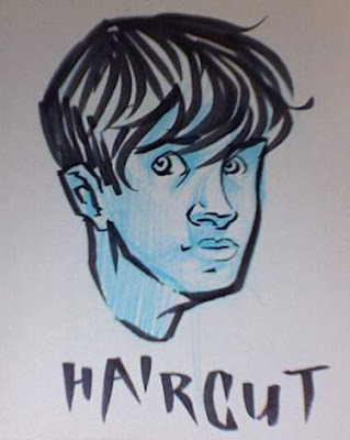
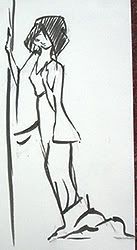
... and then there's this doodle I did in the mirror while Kat was getting HER hair cut. Just 'cause I'm SURE you all want to see my drawing of myself. Right? Who wouldn't?


... and then there's this doodle I did in the mirror while Kat was getting HER hair cut. Just 'cause I'm SURE you all want to see my drawing of myself. Right? Who wouldn't?

Saturday, July 14, 2007
Starter set...
So I'm still shooting stuff in with my webcam. I'd apologize some more for it, but these are just really quick sketches ANYWAY to get a li'l feedback on the way some of these characters are played. Some of them are, in fact, played. So before I go on and do pretty colored drawrings... Whatcha think?


P.S.- I got a SERIOUS haircut. Just thought I'd let you people know. I look like Peter Parker. Or Peter Pan. I'm not sure which; it fluctuates.


P.S.- I got a SERIOUS haircut. Just thought I'd let you people know. I look like Peter Parker. Or Peter Pan. I'm not sure which; it fluctuates.
Friday, July 13, 2007
this is for eric
So I checked and they are PC Jpegs, so that deosn't seem to be the problem, so I've posted a little flower but this time I did it through blogger (once I figure that out.)

Hm...I think blogger just shrinked it to a low quality...I guess I'll see when I post. Can you see both a flower and a butterfly? They should be two pictures uploaded different ways. kinda weird because blogger wants me to use it as a link instead of a IMG SRC which...anyways, we'll see.

Hm...I think blogger just shrinked it to a low quality...I guess I'll see when I post. Can you see both a flower and a butterfly? They should be two pictures uploaded different ways. kinda weird because blogger wants me to use it as a link instead of a IMG SRC which...anyways, we'll see.
Thursday, July 12, 2007
Willing to help
I'm not much of a concept artist, but I do love animating. As soon as you get to that stage, let me know. I can use flash to pencil test (actually very quick and easy with a wacom tablet) or I can go traditional as well. Just let me know what you'd like to see, or how else I could help. I'm way excited.
Are you going to link to everyone else's blogs? Just curious. Mine's KeyserHouse if you were wondering.
-Jason
Are you going to link to everyone else's blogs? Just curious. Mine's KeyserHouse if you were wondering.
-Jason
mommies and draperies
My computer was pretty nice today, only crashed once while putting together this entry. Someone mentioned they couldn't see my pictures last time--is the problem because I use Photobucket to store my pictures? If so, how can I change that, because I'm pretty new to blogger...as in this is my second post using blogger.
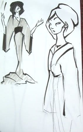
Anyways, the good thing about missing a lot of time on this blog because the internet in my house is lame is that now I know I have a lot of stuff I don't even have to show you pertaining to the master anymore. Since y'all are narrowing down on a face (and my master face looks a lot of the same with bigger ears is all), I started looking around at costuming, and I simplified a getup I found on an old Japanese painting. (sorry if some of these are huge. I think it's photoshop thats crashing my computer, and I went back and made some smaller before it crashed, and I just don't want to go back again to finish the job.)
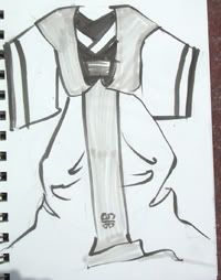
I was looking for a way to add the tiger into his clothes, so I liked the stripes down the middle and the stripes at his long sleeves. The over-tunic (or whatever you call it) reminded me of some white trash vest from the 80's, complete with rockin shoulders. He has a white trash attitude so I jumped on it. Also, for some reason I think all cats should dress like the 80's with big shoulders, maybe its because of too much thundercats and Andrew Lloyd Webber. Yet, what it deos is give the Master a belly thats a different color than the rest of him, much like a cat deos. That and the tail down the front makes...a tail.
It deosn't include showing the feet, which I thought would be an upside for the animation simplicity...but then again it has a lot of lines. Should I look at stuff more simple than this? I only took 160 a year ago, and even when I was animating myself I put too many lines on my characters. Which sucked. Anyways, I gestured it a few times so you can tell me what you think for when I go back to my costuming research.
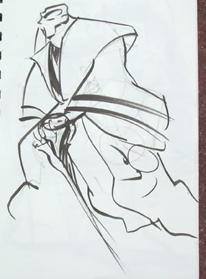
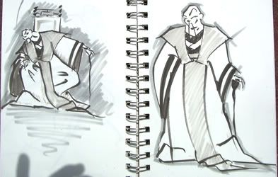
PS the right torso on there is way too high. Like a woman. In fact the entire pose is like a woman. oops.
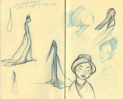
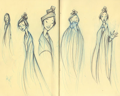
I also have some emo mommies!
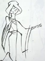
Playing around with her sadness, I put hair over one eye and felt like she shouldn't ever really look up. I played around with the skinniness and whether or not she should have bags under her eyes.
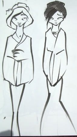
 I was trying out this thing they do in asian paintings where women's dresses do these folds at the bottom and bunch up, but I don't think it worked out too hot here. I eventually stopped doing it so if you see it again I'm sorry.
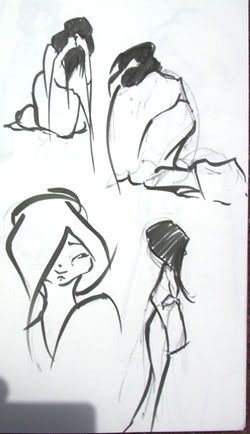
PPS explain to me blogger: how can I go back and edit an old entry if I have a nasty mispelling or something?
Anyways, the good thing about missing a lot of time on this blog because the internet in my house is lame is that now I know I have a lot of stuff I don't even have to show you pertaining to the master anymore. Since y'all are narrowing down on a face (and my master face looks a lot of the same with bigger ears is all), I started looking around at costuming, and I simplified a getup I found on an old Japanese painting. (sorry if some of these are huge. I think it's photoshop thats crashing my computer, and I went back and made some smaller before it crashed, and I just don't want to go back again to finish the job.)
I was looking for a way to add the tiger into his clothes, so I liked the stripes down the middle and the stripes at his long sleeves. The over-tunic (or whatever you call it) reminded me of some white trash vest from the 80's, complete with rockin shoulders. He has a white trash attitude so I jumped on it. Also, for some reason I think all cats should dress like the 80's with big shoulders, maybe its because of too much thundercats and Andrew Lloyd Webber. Yet, what it deos is give the Master a belly thats a different color than the rest of him, much like a cat deos. That and the tail down the front makes...a tail.
It deosn't include showing the feet, which I thought would be an upside for the animation simplicity...but then again it has a lot of lines. Should I look at stuff more simple than this? I only took 160 a year ago, and even when I was animating myself I put too many lines on my characters. Which sucked. Anyways, I gestured it a few times so you can tell me what you think for when I go back to my costuming research.
PS the right torso on there is way too high. Like a woman. In fact the entire pose is like a woman. oops.
I also have some emo mommies!
Playing around with her sadness, I put hair over one eye and felt like she shouldn't ever really look up. I played around with the skinniness and whether or not she should have bags under her eyes.
I was trying out this thing they do in asian paintings where women's dresses do these folds at the bottom and bunch up, but I don't think it worked out too hot here. I eventually stopped doing it so if you see it again I'm sorry.PPS explain to me blogger: how can I go back and edit an old entry if I have a nasty mispelling or something?
Wednesday, July 11, 2007
Another idea
Ok, I agree with Jake about this all kind of getting out of control...not that designs are getting out of control, they are all lovely, they really are, and I think we should do exactly what he said in keeping all of the styles the same and in designing casts, but I have an addition to that post, which is just an idea until I have some feedback.
I think we should vote. Each and every single post or character design should be voted on. Rule. You can't vote on your own. We use a ten scale. One being the lowest and ten being the highest. A three is a three on the ten scale and a one is a one, we can escape using hurtful words this way and we can kill ideas by giving zeros to them. (as a note I don't think anyone has said anything hurtful, but this is a little less confusing than writing paragraphs about things and then having people wonder if you really think we should use it in the film or if you are being polite).
If something gets a consistantly low score (below 5) and is given this score more than three times, chances are we don't even want to elaborate on the idea. I think tens should be saved for finished designs and that nines should mean we by all means would like to further develope the characters.
This means everyone should comment on each post with a single number. This way we know what to develop further and what to drop all together. For example;
Turtlecity: 0
Original Boy design: 9
Simini's wounded tiger: 9
Jake's most recent mother posts: 9
This means, obviously, turtle city is dead and the rest I strongly think we should develop into finished designs...
Tell me what you guys think
No longer yelling...
Some more mother drawings...
I did these after seeing Jake's silhouette of the mother. I wanted to make her very fragile looking, and much heavier at the bottom, sort dripping, like she's wasting away from sadness. Kind of a lille extreme... but I liked the mood. looking at the screen now though she looks kind of evil... hmmm...
Yes, so, ignore the one were it looks like she's vomiting... I was trying to draw her with her ands over her mouth in shock, but, umm, failed. I like the one in the middle probably the best.

I did these after seeing Jake's silhouette of the mother. I wanted to make her very fragile looking, and much heavier at the bottom, sort dripping, like she's wasting away from sadness. Kind of a lille extreme... but I liked the mood. looking at the screen now though she looks kind of evil... hmmm...

Yes, so, ignore the one were it looks like she's vomiting... I was trying to draw her with her ands over her mouth in shock, but, umm, failed. I like the one in the middle probably the best.
Point of conflict!!!
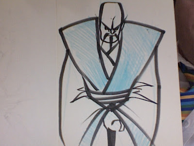
 Here's a watercolor I did of the master strangling the boy. I thought it would be dramatic. I guess this is something of a precursor to the upcoming "cast design" posting. At least I have 2 of the characters in here. So far, I favor Simini's design of the "wounded tiger" master (I'm using too many quote markers...) and Jake's original design of the boy remains popular. I don't know how simplified this should be. Obviously the concept art will most likely remain more detailed than the finalized animatable designs we decide on. I hope to simplify and modify these designs & post something later with everyone in an animatable fashion. Could someone post a list of exactly who everyone in the cast is? I can think of the boy, the master, mom, dad, the water spirit... who else? Let me know what you think of this design so I can have direction as to how I should tweak this for later posts.
A desperate attempt to get Simini to stop yelling at me with her keyboard...
In demonstration of how we're still posting stuff that we come up with as we do so while still working towards a feel for the film... here are some drawrings. And it's okay.


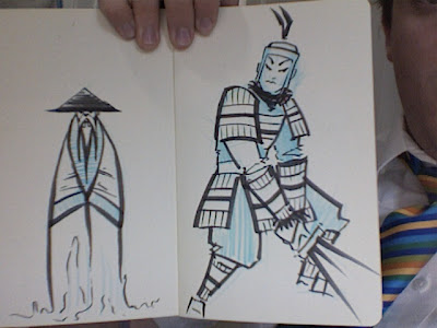
Master, Mother, and Water Spirit Quickies
Here are some rough (and I mean rough) sketches for a few characters. My sketches are intended as exploratory as opposed to trying to peg the final, animatable design. At the least, you could say they're exploring extremes so that we know for sure where we don't want to go.
 This is a sketch of the boy's mom in their situation after the dad dies at war. I had the idea of the mother having to work in the fields in horrible conditions.
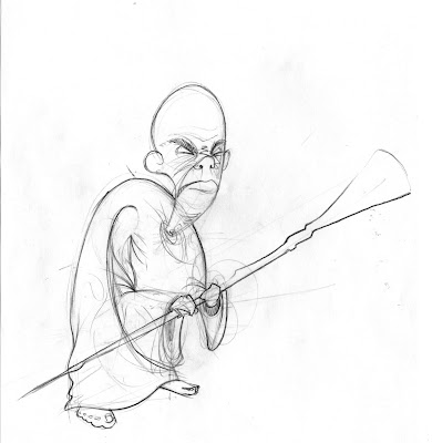
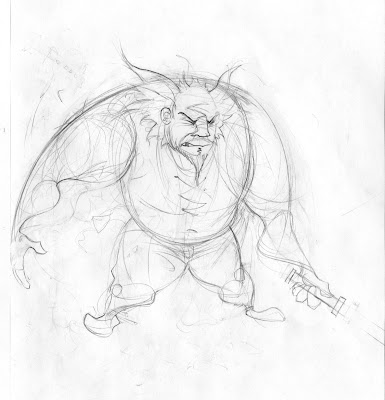 Here's a couple of sketches for the master. I wanted to explore different extremes with this character, as far as age and size go.
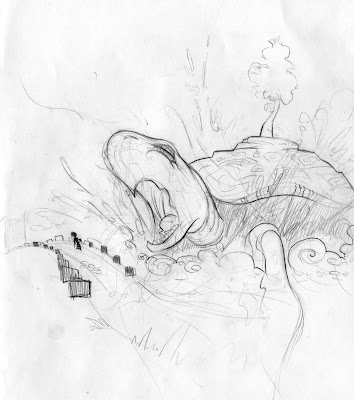 And finally, yes, I'm not giving up on the sea turtle water spirit, because I think it's AWESOME, whether it's Chinese, Japanese, or Indian or whatnot. I mean, just imagine a ginormous turtle surfacing next to the bridge! Pretty much I'll be pushing this idea until it becomes a capital offense.
 This is a sketch of the boy's mom in their situation after the dad dies at war. I had the idea of the mother having to work in the fields in horrible conditions.
 Here's a couple of sketches for the master. I wanted to explore different extremes with this character, as far as age and size go.
 And finally, yes, I'm not giving up on the sea turtle water spirit, because I think it's AWESOME, whether it's Chinese, Japanese, or Indian or whatnot. I mean, just imagine a ginormous turtle surfacing next to the bridge! Pretty much I'll be pushing this idea until it becomes a capital offense.
DIRECTION!!!
Ladies, Gentlemen, and the rest of you.
It has been brought to my attention that we are doing a bit of drifting in our design and story development. So... we have prepared for you a new and exciting task, a central direction that we will be following until we arrive at the desired destination.
Design the cast.
Ron's pre-giant-freaking-turtle post consists of stylized versions of each character in the film, together, more or less complete, tied together by commen elements in design.
Let us all do that. Each of us will put up, in one post, every character in the film, done in the same style and at the same level of completion. That is the format. That is the challenge. That is our direction.
I hope that, by doing this, we will arrive upon a style in which to continue our adventures in story and design, a style that we can all emulate, and a style that rocks.
With respect to backgrounds, I spent quite the pretty penny on books in chinatown- books on architechture, culture, clothing, etc. I would like these books to be used in development, so I'd like to hold off a bit on serious set development. Let's nail down our characters. Give 'em some personality. Give 'em some style.
Go to, and rock hard.
Tuesday, July 10, 2007
O.K. heres those boards I was working on. If there are still some turtle lovers out there you will like these. I did the turtle boards sometime last week before the turtle haters made their comments. Anyway, I dont think they would be hard to do and I think they would add an extra amount of interest to them, but I'll drop it if no one else likes it.
 The film starts out in complete white and fades into this scene showing the turtes walking around with cities on their backs. the camera zooms in on the middle one as it slowly pans down.
 The camera goes into another cloud and fades to white.
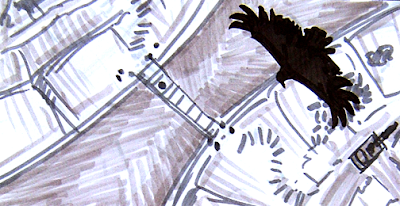 Show the boy leaving the turtle to go to another trtle or the main land across a bridge. A bird of prey flies overhead.
 his reflection
 The film starts out in complete white and fades into this scene showing the turtes walking around with cities on their backs. the camera zooms in on the middle one as it slowly pans down.
 The camera goes into another cloud and fades to white.
 When the camera comes out we are closer up on the bottum tier where the camera begins to pan up the city.
 The camera stops when it gets up to where the boy lives and the story begins.
 One of the battle flashes.
 Show the boy leaving the turtle to go to another trtle or the main land across a bridge. A bird of prey flies overhead.
 The boy takes one more sad look behind him to see his mom. He knows its going to be a while before he sees her again.
 There are two men with axes waiting at the other end who move aside and then cuts the ropes when he is all the way across.
 The boy knocking on the door of the grumpy man.

 his reflection
 dads reflection
 uh oh!
 shadow of the serpent spirit.
 pan up on the serpent.
I kind of like the turtle idea because turtles kind of represent a home anyway. Plus I think it is better if our hero actually has to remove himself from his original environment as part of his journey. I think it makes him more alone which could add to the unfair life he has been dealt. I think it is better if he has to live with the man and dosent go home to his mom every night.
I did these 3 days ago


I did these a few days ago as well as a bunch of boards. The boards have a turtle in them dang it. So in the name of awsome you have to keep an open mind one last time and then I'l let it drop. I don't have time to post the boards now. Hopefully later today.
I'm a big fan of Jakes original design for the boy, so I tried to take what I liked in the other characters and get them all to match together. So if your looking at these designs and saying "dude I already drew that", you know why.
Subscribe to:
Posts (Atom)